
Tips for Choosing Calm Colors to Create a Peaceful Home
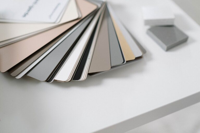
Creating a peaceful environment in your home starts with the right colors. Calm colors can promote relaxation, reduce stress, and make your living spaces feel more inviting. But with countless shades and hues available, how do you choose the perfect calm colors for your home? In this post, we’ll explore helpful tips to guide you through the process of selecting soothing tones that suit your style and space.
Why Choose Calm Colors?
Calm colors are typically soft, muted, and balanced. They can include shades of blues, greens, grays, and neutrals that evoke a sense of tranquility. Using these colors in your home helps create a feeling of serenity, making your space a comfortable retreat from the busy outside world.
Understanding Color Psychology
Before diving into color choices, it’s useful to know how colors affect mood:
– Blue: Often associated with peace and calmness, making it ideal for bedrooms and bathrooms.
– Green: Symbolizes nature and balance, promoting restfulness.
– Gray: A neutral color that offers stability and sophistication.
– Beige and Soft Whites: Warm neutrals that create cozy and inviting atmospheres.
Knowing the emotional impact of colors can help you pick shades that support relaxation.
Tips for Choosing Calm Colors for Your Home
1. Consider Your Lighting
Natural and artificial lighting dramatically affect how colors appear.
– Natural light tends to enhance true hues, so test your color samples during the day.
– Warm lighting may make cool colors feel softer, while cool lighting can brighten warm tones.
Try painting sample patches on your walls and observe them at different times to see how lighting changes their appearance.
2. Pick a Color Palette
Choose a harmonious color palette to ensure the colors blend well.
– Use a monochromatic palette by selecting different shades of one color for a cohesive, soothing effect.
– Incorporate analogous colors (colors next to each other on the color wheel) like blue and green, which naturally complement each other.
Sticking to 2-3 main colors helps maintain balance and prevents overwhelming the space.
3. Use Soft, Muted Shades
Avoid bright, intense colors if your goal is calmness. Light, muted shades reflect less light and are easier on the eyes.
Examples of calm colors include:
– Pale blue
– Sage green
– Soft lavender
– Light gray
– Warm taupe
These colors create a gentle backdrop that encourages relaxation.
4. Balance Warm and Cool Tones
Both warm and cool tones can be calming, but balance is key.
– Cool tones (blues, greens) promote freshness and serenity.
– Warm tones (beiges, soft yellows) add coziness and comfort.
Adding a mix of these tones via paint, furniture, or accessories can prevent the space from feeling cold or dull.
5. Match Colors to Room Purpose
Think about the function of each room when choosing colors.
– Bedrooms: Choose tranquil hues like soft blue or lavender to encourage restful sleep.
– Living Rooms: Warm neutrals or soft greens can foster relaxation and conversation.
– Bathrooms: Light blues or seafoam greens create a spa-like, refreshing atmosphere.
Tailoring colors to each room’s use enhances comfort and mood.
6. Coordinate with Furniture and Decor
Make sure your chosen colors complement existing furniture and decor.
– Neutrals often work best as wall colors since they match various styles.
– Use accent colors in pillows, rugs, or artwork to introduce calmness without committing to large surfaces.
A coordinated look creates an inviting and harmonious space.
7. Test Before Committing
Always test paint samples on your walls before painting an entire room.
– Observe the color in different lighting throughout the day.
– Live with the sample for a few days to see how it feels.
– Consider viewing samples with your furniture nearby.
This step ensures you’ll be happy with the final color.
Additional Ideas for Enhancing Calmness with Color
Use Color in Layers
Don’t limit yourself to just painting walls. Softly painted furniture, curtains, and rugs can reinforce calm tones.
Incorporate Natural Elements
Materials like wood, stone, and plants naturally complement calm colors and enhance a peaceful vibe.
Avoid Overuse of Bold Colors
If you love brighter colors, balance them with calm tones in larger areas, such as walls or floors, and reserve bold colors for small accents.
Final Thoughts
Choosing calm colors for your home is about creating a space that feels peaceful and welcoming. By understanding color psychology, considering lighting, and testing shades carefully, you can select colors that make your home a calming retreat. Remember to balance tones, coordinate with your belongings, and tailor choices to each room’s purpose. With these tips, your home can become a soothing haven where you truly feel relaxed.